Collaboration isn’t always easy in group projects. Not all students are instantly great teammates due to different priorities and time of availability. The biggest challenges students across the country face are finding time for team meetings and getting teammates to contribute equally.
Our clients Vinesh Kannan and Brendan Batliner decided to tackle this problem in 2015. Today, it’s called Omnilabs and over 60+ universities around the world use Omnipointment to organize team projects. The Omnilabs suite consists of Omnipointment and Charter. Omnipointment helps students identify the best time to schedule meetings, work on group projects, other initiatives. Charter is a tool that focuses on tracking team progress and aims to make group work delegated equally and create a productive setting by allowing teams to set objectives, clarify expectations, define team roles, and track the completion of all task.
My team of designers was challenged to align our ideas with both Vinesh and Brendan product vision. Both the clients vision differed occasionally. One client loved gradients while the other loved a minimalistic color scheme. However, both clients wanted the tool to remind them of a Learning Management System (LMS) in a friendlier version. Clients explicitly said that they do not want stock photography because the photos looked too fake. They wanted a design that students would willingly want to use it rather than being forced. My team worked to redesign an approachable interface for Omnipointment and created a design language for Omnilabs suite of tools.

The logo for Omnipointment wasn’t universal for all other Omnilabs suite of tools.

The UX of Omnipointment was very limited and my team needed to figure out some problems before diving deeper into our visual designs.

The UX of Charter was in the beginning stages of development; therefore, designing the most suitable interface was difficult.
Prior to meeting with our clients, my team thoroughly read through all the documents that our client gave us. We prepared 10 look and feel of designs that they may consider along with some questions. Some example questions are why did you choose the current color palette, what changed would you like to see, what are your favorite products/inspirations/brands? We met with the client to talk about their brand goals. Together we came up with a list of adjectives they would describe their product as. These adjectives are: playful, professional, educational, efficient, collaborative, and supportive. After the meeting, we had enough knowledge to start analyzing the suite of tools to implement better design decisions.
Before my team began to explore our own design directions, we did a visual analysis of Omnipointment competitors. There were a good amount of competitors that shared the same vision but none of them were strictly directed towards a LMS suite of tools. For that reason, we researched out of category competitors who share the same idea of a design language and took a closer look at how they make their personal branding distinct yet uniformed.

When is Good had gray monochromatic schemes with no accent colors, no imagery or illustrations. Their logo was in bright green which made it hard to see. The grid used was too crowded and hard to follow. Since white space was very limited, the bold and unbolded words weren’t as easily distinguished.
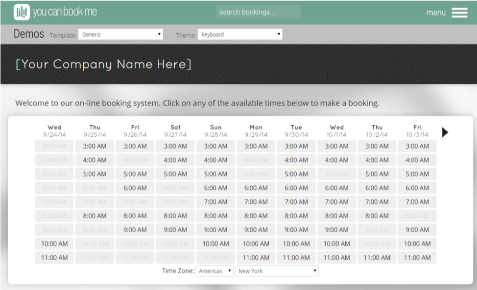
You can book me used imagery minimally. Instead, more illustrations and iconography were used. They had a clean grid system on a white background which made it easier for users to read. The negative space was used effectively and made it feel approachable and welcoming. Also, the logo design spoke the same design language as the interface.

Trello had color customizable boards and uses a card layout with slightly rounded corners. It is legible, approachable, and easy to skim. The page could be scrolled horizontally and vertically.
1. Slightly rounded corners and buttons created a sense of friendliness.
2. Use of cards created a clear hierarchy, organization and brought the important information to the front.
3. Use of negative space was important to avoid distractions.
4. Use of clean grids with minimal use of color was easy on the eyes.

Google Drive did a tremendous job in creating all their tools consistent yet easily distinguishable. The color coding and iconography of each tool is intuitive and approachable.
Salesforce created a very friendly feel with the use of colors. The colors used are not overly bright and colorful. Salesforce used muted colors instead which made it less straining to the users' eye. White space was used thoughtfully to break up all the content-heavy information.
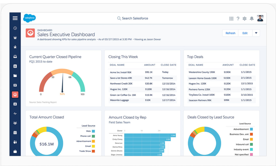
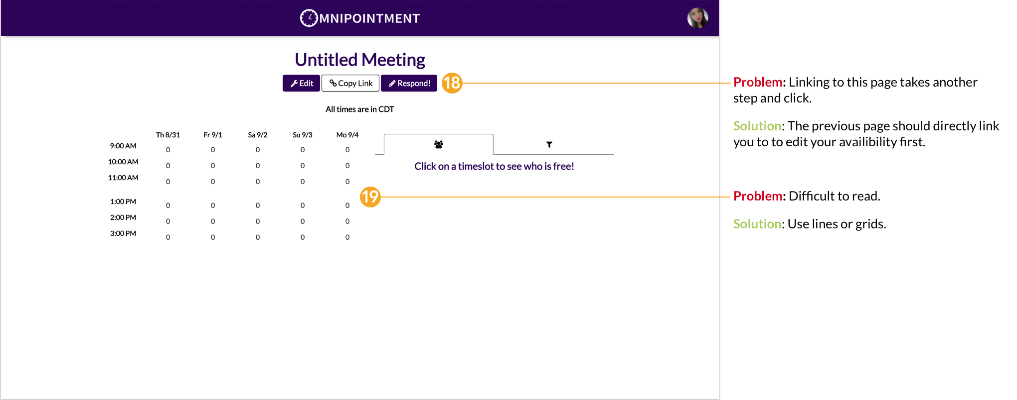
1. Organization of the big umbrella with different colored subfeatures.
2. Universal design language.
3. Bright colors are used to bring a friendly and approachable feel, but at the same time, it still looks professional and trustworthy.

We want students to enjoy using Omnipointment as a tool to be successful at school and as a stepping stone to the professional world.
Incorporating bright colors, lighter interface and rounded elements to bring a friendly and fun appeal.

We want our users to avoid taking that extra step learning a new tool because time management is essential.
Using familiar grid patterns and time slots will make it efficient for our users.

We want to make group work easier. Organization and clarity will allow teammates to better collaborate and be committed.
Using card layout, negative space and sans serifs will create a consistent hierarchy.
Gradient / Minimal use of color: Rather than only using flat colors, the gradient gave it dimension and character. It delivered a sense of a lively and trendy design. The white space made it easy to guide the users to look at the important sections of the screen without any distractions. Rounded elements made it friendly and filled icons made it stand out within the white space.
I used Avenir for the typography.
Bright & fun colors: For this approach, I went for a flat design. I used a rounded call to action, rounded line icons that made it cohesive with the friendlier colors. Subtle lines in the background also gave a texture that made it feel approachable and fun. It also made it stand out with the sharp corners. I used a fun and legible font type called Lato.

Colorful: This approach looked more sophisticated with the darker blue and gray interface which reminded users of college colors. The brighter orange and red made it more energetic for the users. I aimed to use these colors to balance out the friendly but still professional look. The thick line icons also made it fun and welcoming.
Our client thought that style tile 2 was more suited for their brand. However, not all elements were suitable. For example, the clients did not like too much turquoise blue so going on with my design, I focused more on the other colors. I wanted to show how elements from my style tile would translate to the mock-up screens.
After the review, our client still thought that they wanted an interface like Salesforce. We looked at Salesforce interface again and dissected elements that made it intuitive. The three key elements were:
1. Salesforce used friendly colors but very sparingly. They also muted the colors a little so it doesn't strain the user's eye.
2. They used a darker blue to reinforce a sense of professionalism.
3. They used cards to push the important content forward.
Before we moved on to mock screens, I refined my style that incorporated all the elements that received positive feedback to align with our clients’ target.
As a team, we wanted to improve the experience. We reviewed the flow of the wireframe and layout before exploring our own design directions. We knew where our clients wanted to define their brand goals and the flow of the website. After reviewing the wireframes, we found that some things needed improvement:


Before user testing, we created some testing goals:
1. We wanted to make sure that our individual designs align with our design principles.
2. We wanted to make sure that any changes to the interface are easily-navigable and intuitive.
3. We wanted to make sure our designs are applicable to our primary target audience (college students).
My team organized two rounds of user testing to make sure our individual designs aligned with our design principles and spoke to the Omnilabs brand. We tested different college students and instructors (men and women) to confirm that our designs were applicable to our primary target audiences. The first round of testing focused on individual screens. The second round allowed users to go through one flow as a prototype.
Some feedback I received on my mock up screen:
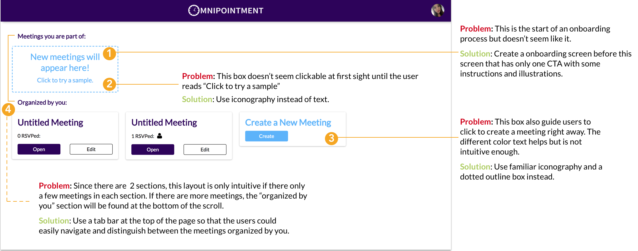
1. Users liked the minimalistic look of the interface. They also favored the color coding of each card and said if it is customizable, then it would be perfect. However, they thought that the black text over the clickable area was a little too busy.
2. Users liked that it felt familiar to them because it looks like a whiteboard. They thought that the blue buttons and color stripes caught their attention.
3. Users felt that the plus icon was not intuitive enough and wasn’t sure what it meant at first.
Based on testing feedback, I made changes to my screens accordingly which is displayed in the final design:
1. I kept the minimalistic look of the interface but switched some colors around. I also kept the color coding of each card to cater to the user’s need.
2. I change the black text and iconography to white in the clickable area to make it feel more like a button.
3. I kept the layout and colors that grabbed the users attention and made final touches to perfect it.I added a dotted line box around the plus icon to make it more intuitive and feel like a clickable card.
Some feedback I received on my mockup screen:
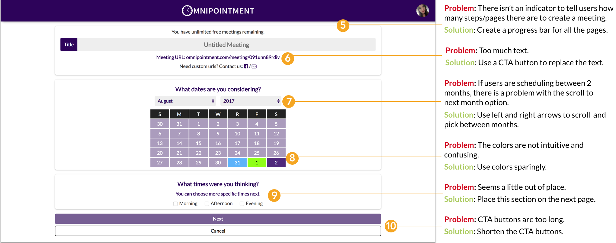
1. Some feedback I received on my mockup screen:Users loved the progress bar at the top so that they knew exactly how many pages they had to fill out. They also thought that the calendar was easy to read.
2. Users didn’t like that you couldn’t add a description note under the title.
3. Users didn't like the color of the CTA buttons.
Based on testing feedback, I made changes to my screens accordingly which is displayed in the final design:
1. I kept the progress bar and calendar because the users felt that it was very intuitive. However, I did some minor changes to the colors.
2. I added a description box under the title box.
3. I changed the distance and color of the CTA buttons to make it feel more cohesive.
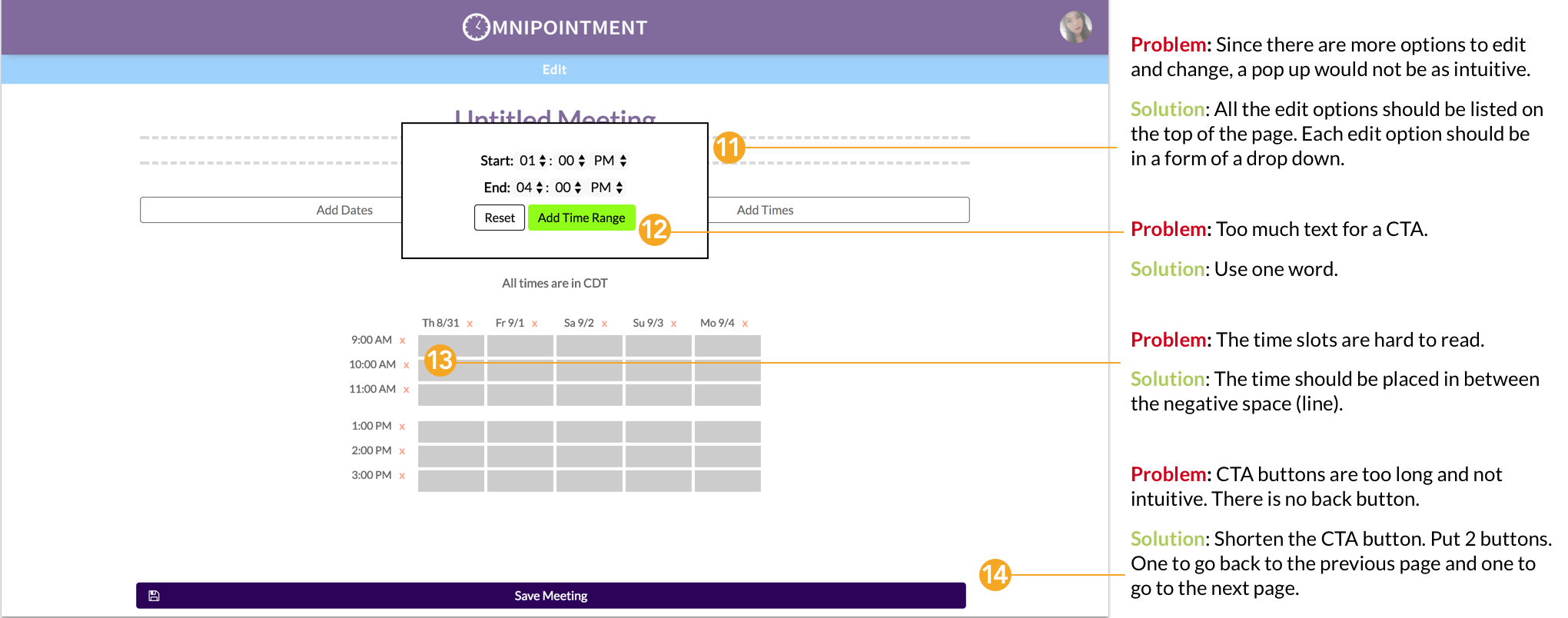
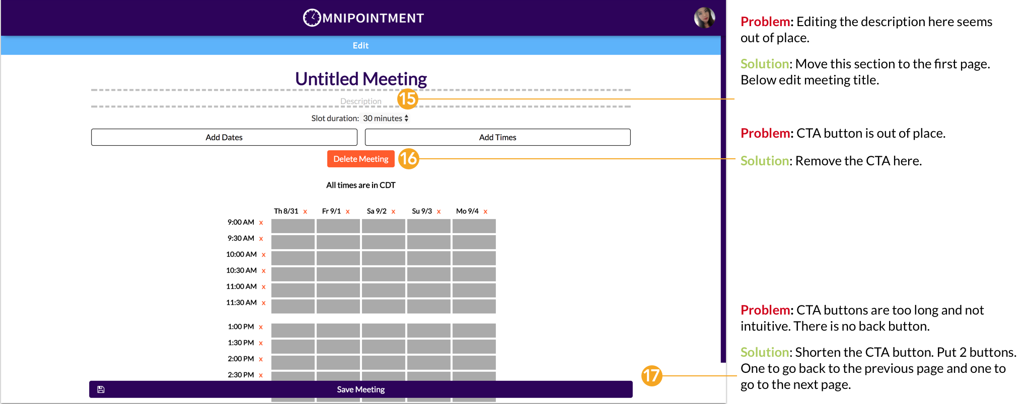
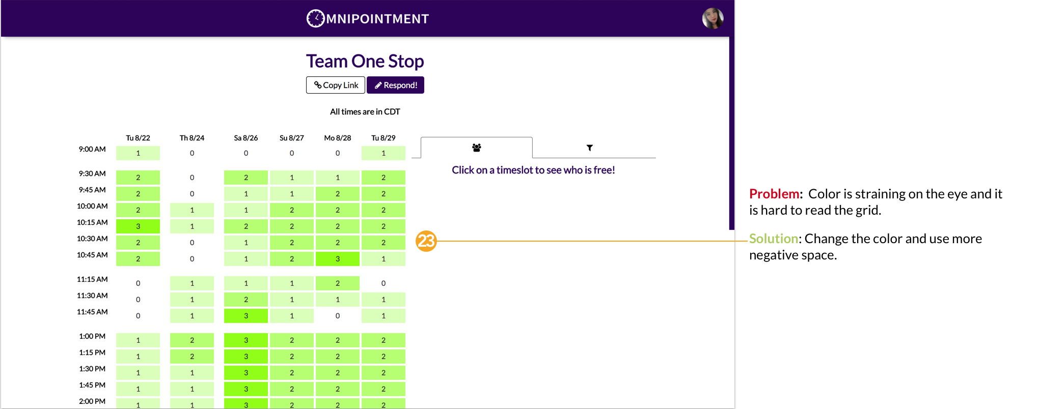
Some feedback I received on my mockup screen:
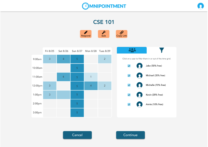
1. Users did not like the big bulky squares and buttons. They thought that the orange color for the buttons did not fit well and the iconography was too small.
2. Users thought that it looked cluttered because there isn’t enough space between the boxes. It looked like too much going on in this area.
3. Users thought that the blue opacity was a bit confusing. However, they thought that the numbers were very helpful.
Based on testing feedback, I made changes to my screens accordingly which is displayed in the final design:
1. I changed the grid to a rectangular shape with slightly rounded corners. I also revised the shape and color of the buttons and placed them in the top right corner.
2. I added more negative space in between the boxes to make it less cluttered and more legible.
3. I kept the numbers but changed the opacity colors that correlated with the numbers.
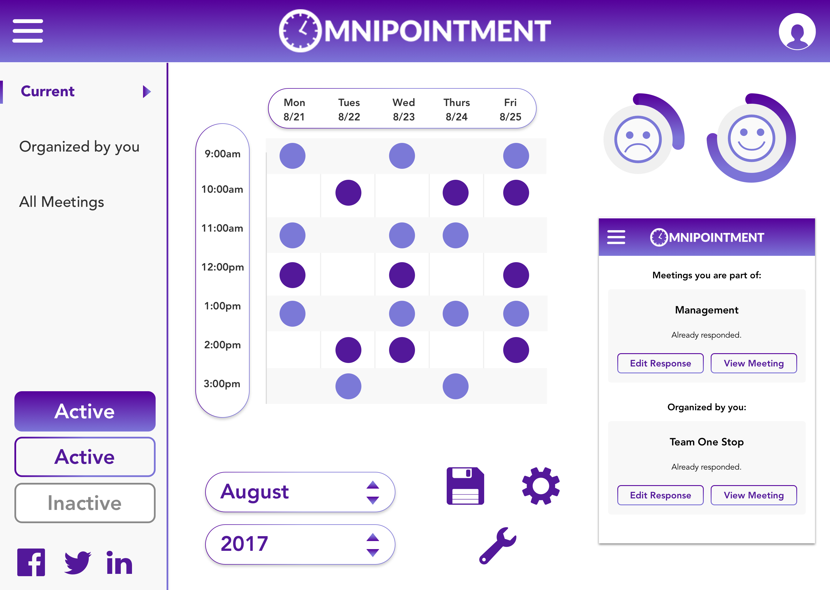
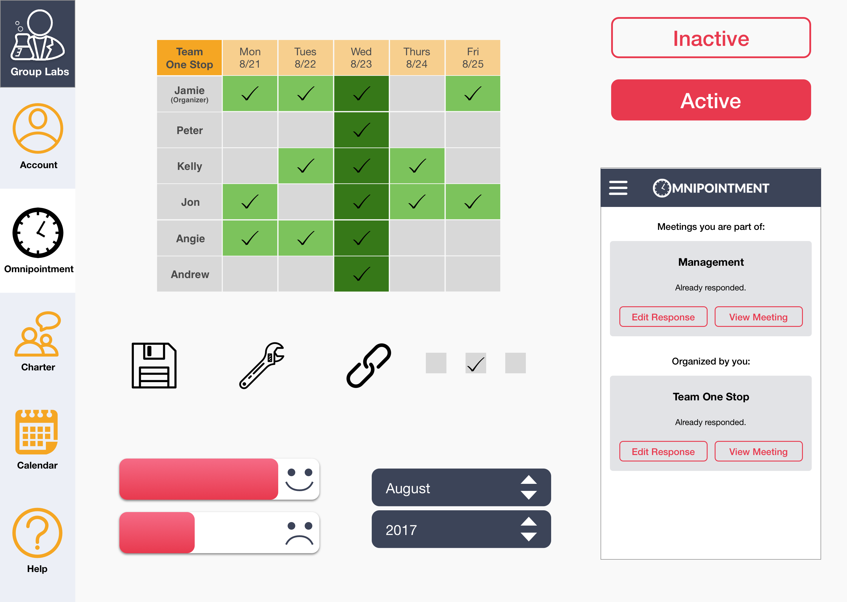
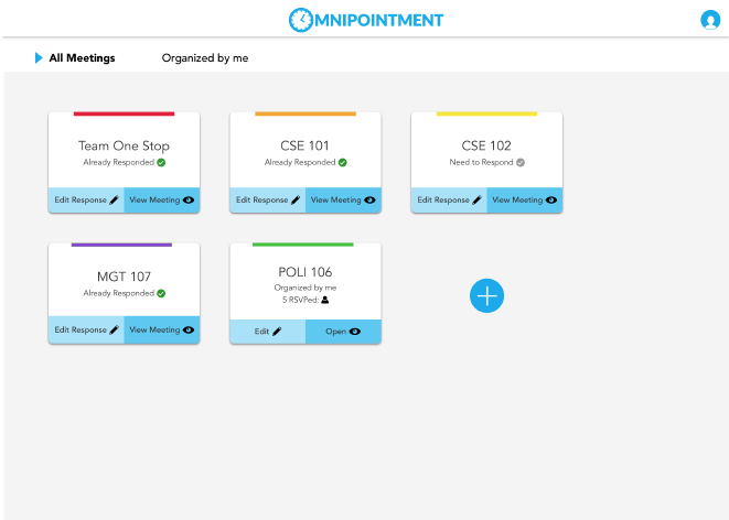
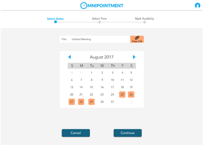
These are some of the final screens I designed for Omnipointment and Charter after many rounds of user testing and iteration:
.png)

.png)

.png)


.png)
With these final screen mockups, I created an InVision prototype to allow users to walk-through the flow of Omnipointment web app. This video of the prototype will demonstrate a better overview of how the screens will look live.
The video highlights the flow "create a meeting."
Our client appreciated my style exploration and applauded my bright and friendly theme. They thought that I successfully iterated through user testing. I created a style guide for Omnipointment to better summarized my final design decisions and how future designers and developers should follow this guide.
I am content with the work that I created for Omnilabs. With more time given, I would have loved to explore more UX design considerations and translate it to high fidelity assets and then test it:
1. Sync with other calendar apps/showing scheduling conflicts within Omnipointment and with other apps.
2. A system of reminders that an upcoming meeting is taking place, or that you still have to respond to a meeting invitation.
3. A system of notifications for when someone has responded or changed their response.
4. Optimizable color-coding (for categorization).
5. Optimizable meeting orientation and location (for prioritizing).
6. Messaging within Omnipointment to send reminders/invitations.
7. Saving contacts for recurring team members.
Working with clients who are in the process of building their product inspired me to try very different designs. I was able to quickly eliminate designs that didn’t fit my client's vision. When I knew specific design elements that the users and client liked, it easily paved the way for all my designs decisions. The client's vision kept wavering in the direction of their product. I learned that some of their insights on design elements weren’t always the most functional approach, so I needed to assert the good design versus bad design. Then I had to backup my designs with a bunch of user testing. As a designer, my goal was to create a better user experience and solve those challenges. I learned to find the right balance to empathize with both the user and client’s need.